Lettering Waves
 My inspiration for this project came from the book, Hand Lettering, by Marci Donley & DeAnn Singh. The authors call this “Writing Between the Lines”, but we’ve renamed it “Lettering Waves” since we live in a surfing community where waves are a pretty big deal!
I taught this lettering style to my middle schoolers and the results were fantastic! You’ll find so many applications for this fun way of writing…. use it to write out a favorite verse, quote, or poem, make greeting cards for birthdays and other holidays, or simply fill your art journal with a beautiful message. I’ve also seen this technique described as “Slow Journaling”…. check out the Daisy Yellow blog for some great examples. Call it whatever you like, but be sure to try it!
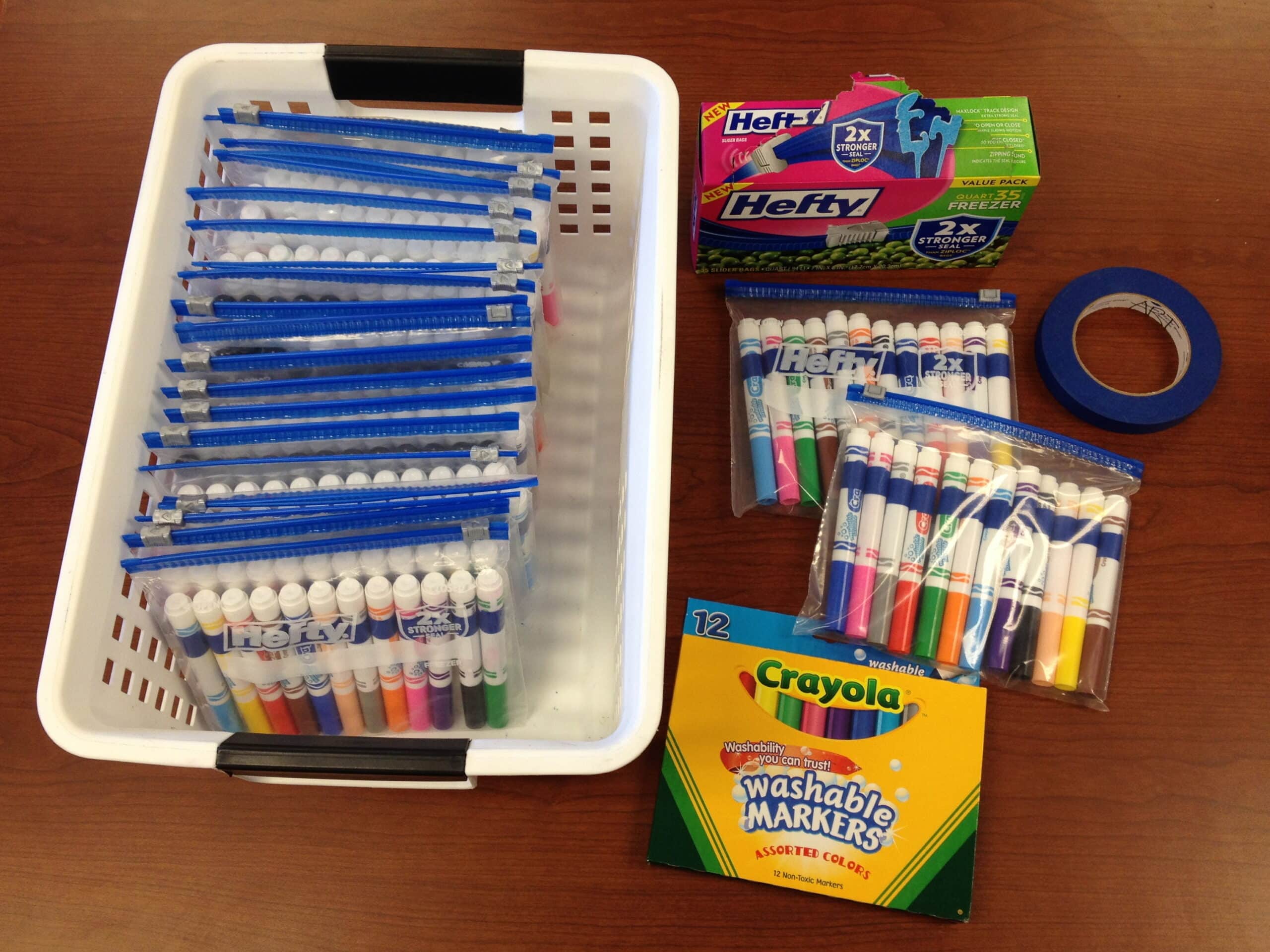
Materials:
- paper (we used 9×12 white heavyweight construction paper)
- pencil and eraser
- black “F” Sharpie marker
- Crayola Watercolor Pencils
Directions:
- Choose the text you want to write out.
- With a pencil, lightly draw a ½” border along each edge of your paper.
- Next, lightly draw some wavy guide lines across your paper. (If you’re copying a specific text, divide it up by how much you want to write on each line. That way you’ll know how many lines to draw!)
- Now add your text lightly in pencil, filling the space between each line, using basic san serif letters in all capitals (a.k.a. “stick letters”) . Touch both the upper and lower lines with your letters. (To make your text fit on each line, you’ll be making some letters wider or narrower as needed.)
- Trace over your letters with Sharpie, but do not trace over the lines!
- Erase your guide lines, border, and any other pencil lines that are still showing.
- Use watercolor pencils to add color inside the closed shapes of each letter. Then fill in around your letters with contrasting colors. It’s okay to leave some areas of white if that works with your design.
- Finally, blend your colors with a damp brush. You only need a small amount of water when you work with watercolor pencils, blotting your brush on a paper towel each time you rinse it. And be careful not to let complimentary colors mix, or you may end up with “mud”! (Complimentary colors are colors that are across from each other on the color wheel: red/green, blue/orange, yellow/violet… try mixing these colors when you want a variety of interesting browns!)
What other uses can you think of for this lettering style?


Hi Cheryl,
I just love all the art that you post, so creative. My daughter went to an art high school so I know how important art is, especially for those that need that creative outlet. Anyway, I was just stopping by to wish you a Happy Thanksgiving!
Shawna
The Picture Book Teacher’s Edition
Happy Thanksgiving to you, too, Shawna! I enjoyed looking at your site – very helpful for teaching with children’s literature!
i kinda thought of a good name and that is wordart
Good idea, Laura!
Hi, Cheryl. This is a nice twist on one I did with one of my classes. We did
just their names, but I like the idea of doing a poem or bible verse. Thanks.
Your posts are such fun!
Another great post! I would try it with some haiku (small japanese poems consisting of three lines with 5/7/5 syllabels. Look for them, I’m sure there must be English translations and English (or American?) poets, too.
Great idea to do this with haiku, Susanne! Thanks for sharing that!
Great idea to do this with haiku, Suzanne! Thanks for sharing that!
This is wonderful! I know my children will enjoy it. Thank you so much for the step-by-step details…. I can learn and do along with the ‘class’….
Hi Cheryl: Your posts are so inspiring! Thank you so much for all your awesome ideas. I have used some of them in my art classes I teach for a homeschool group. I hope I linked back correctly from my blog!